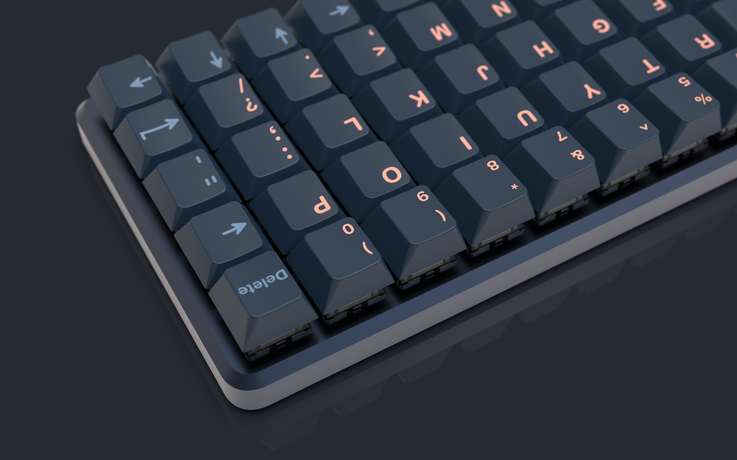
Kotai
The Kotai design Line was the first design I released into the mechanical keyboard community. It is an enclosure for the popular OLKB Planck and Preonic pcb’s and was meant as an alternative to the current case offerings. The Kanji on the bottom of the case is read as “Kotai” in Japanese and translates to the word “Solid”, which was my main focus with this design.
The design process
I was already in the hobby for about 1,5 years when I started designing the Kotai case. I had tried out a few different boards and was constantly on the lookout for something new. However, I still couldn’t find the exact combinations of features in a single board, and there was always something a board was lacking in my opinion. It was either too big, didn’t have a style I liked or was simply too expensive for what it was.
Since I studied industrial product design and knew a thing or two about CAD design and manufacturing I decided to start designing my own board to try and see if I could make all these features come together in one design. Compactness, ergonomics and heft, those were the things I strived for in my design. This resulted in the creation of the Kotai design line.
When I first requested a few quotes to machine a single case I was greeted with prices that rivalled the cost of a small car. This obviously was a no-go for me as a student so I decided to go online and see if there were other who were interested in joining in on a production run. This was answered with a lot of positive feedback and a lot of people joining me for both production runs of the Kotai case in two different form factors (40% and 50%).
Main features
Solid 4mm thick
The entirety of the case is manufactured out of CNC aluminium/brass with and even wall thickness of 4mm. This gives the board some heft while still remaining compact.
Ortholinear layout
In contrast to the more common staggered layout where the rows are stacked diagonally the ortholinear layout places the keys in a straight grid. This not only looks pleasing to the eyes but also improves ergonomics by reducing unnecessary finger travel.
Floating switch design
One of the most interesting parts of a mechanical keyboard are the switches themselves. The case leaves the sides open so the top housings of the switches are exposed. This gives an extra opportunity for customizing.
Appreciation
I would like to thank the following people that helped me out immensely over the past time with this project.
Salvun for helping out with the second round of the Kotai line and becoming my main manufacturer since then.
Jack Humbert for letting me use the Planck and Preonic pcb's as a base for the Kotai line and providing the necessary CAD files.
And of course all those who joined the Gb's for joining and the great response <3


